Every year, through thoughtful consideration and trend research, Pantone selects a colour of the year which influences product development and purchasing in multiple industries, including fashion and interiors. Last year we had the timeless and elegant ‘Classic Blue’. In 2019 it was the vibrant yet mellow ‘Living Coral.’ For 2021, Pantone have selected two colours, ‘ Illuminating’ and ‘Ultimate Grey’ – the second time they have done this in their 20 year history of selecting a Colour of the Year. The union of the two is said to ‘encapsulate deeper feelings of thoughtfulness with the promise of something sunny and friendly.’ At Bernard Interiors, we never shy away from using bold colours and we’ve used shades similar to Illuminating as subtle injections of colour in several of our projects.
In a recently completed luxury apartment project in Marbella, this shade of yellow features in two of the bespoke pieces of artwork we commissioned from an artist in Brittany, France. It appears again in contemporary artwork in the master bathroom. When used against a neutral palette, it provides a welcome addition of colour, creating a warm and modern interior. Little pops of yellow appear throughout, in the beautiful, botanic inspired Porta Romana lampshade in the entrance and a subtle pop in the Bella Freud candles, carefully positioned on a stack of chic hardback books.
The shade of yellow also works well in exterior spaces, as shown in the terrace of a past villa project in Marbella. We’ve used it here in cushions and trims to tie in perfectly with the olive trees in the sunshine!
At Audley Nightingale Place in Clapham, we decided to go bold in the guest WC lobbies, using the abstract Christopher Farr Cloth wallpaper, ‘Fathom’, to create a punchy feature wall. The wallpaper resembles watercolour brush strokes cascading down the wall – fun, vibrant and eye catching.
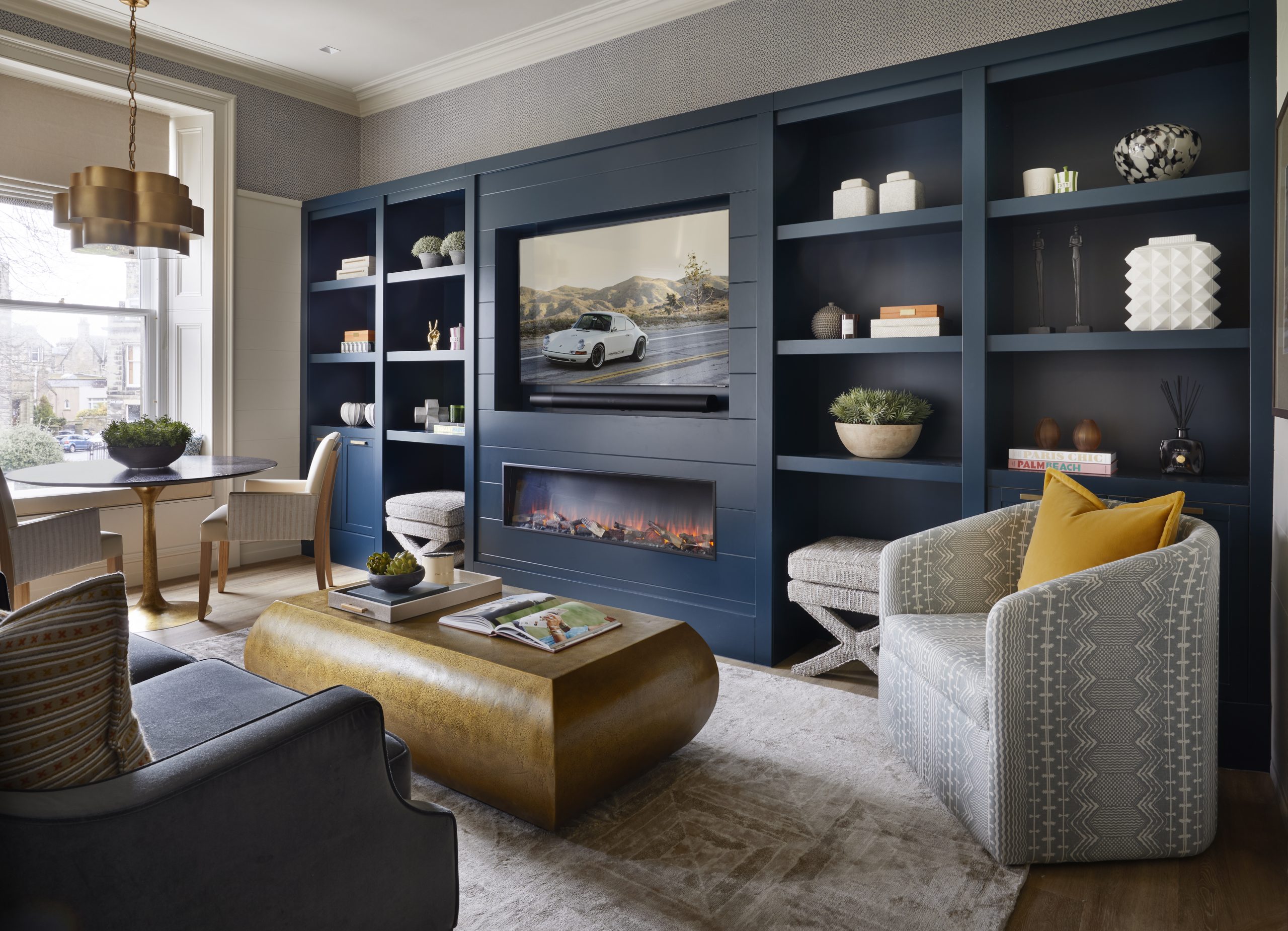
Illuminating is a much brighter yellow than the commonly used mustard. It’s not a colour you would necessarily use for furnishings or as a solid paint colour on walls, however when used as a subtle accent in artwork and accessories against a fresh and clean backdrop, the results are rather lovely and most certainly uplifting!


